Apple has always been a trendsetter in the realm of technology, steering the ship of design innovation with a distinctiveness that resonates throughout its extensive ecosystem. With the recent unveiling of the Liquid Glass design language during the WWDC 2025 event, Apple has embarked on yet another ambitious endeavor to redefine user interfaces. The concept introduces a unique aesthetic that creates a more dynamic interaction with both software and hardware. It begs the question: is this radical shift a sign of genius or simply an overreach?
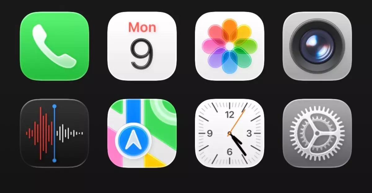
The Liquid Glass design seeks to infuse a sense of depth and fluidity into the user interface, allowing elements such as app icons and menus to feel as though they float above the backdrop of your lockscreen or home screen. This playful approach gives users a sense of transparency and timelessness, yet it simultaneously raises concerns about usability and clarity as we navigate the digital landscape. Is the visual allure overshadowing practical functionality?
The Allure of Translucency
Upon initial encounter with Liquid Glass, the overall aesthetics are undeniably captivating. The “floating” effect, where icons and key functions appear to shimmer over various wallpapers, offers a modern flair that many users may find appealing. The translucency adds a layer of depth that was previously absent in Apple’s interface designs. However, there’s a catch: as the old adage goes, sometimes less is more. The transition into such a visually arresting landscape may leave users grappling to adapt to a barrage of shiny, reactive elements that demand attention at every glance.
A particularly striking feature is the rounded tab bar within applications. Touching slightly beneath its glossy surface, the animation resembles a droplet gliding across a water surface, which looks elegant at first but could detract from actual efficiency. This can ultimately confuse users who expect traditional feedback from user interactions. Striking a balance between aesthetics and usability is where Apple will need to excel if they hope to win over a diverse user base.
Cluttered Control Center: A Case for Minimalism
One aspect that stands out glaringly in the Liquid Glass design is the revamped Control Center. While Apple’s intention may have been to deliver sophistication with glassy effects, the end product often feels cramped and overwhelming. With an intentional grayscale home screen, the visual clutter becomes pronounced, leading to difficulty in quickly identifying essential functions at a glance.
This brings about larger implications concerning modern design principles: the challenge of retaining clean lines and easy navigation in a visually rich environment. Innovation should not come at the expense of basic functionality. One might argue that Apple’s design team already has a tall order ahead: refining this illuminated vision without compromising on user-centric principles.
The Mixed Bag Of Experience
The variation in design elements has presented a mixed bag for early adopters. Amongst the numerous changes, the keyboard adopts a fresh look, and even individual application adjustments (such as overly large gaps in the Settings app) might frustrate some users. While some elements offer delightful surprises, others clearly require optimization. A criticism that is hard to ignore is that many aspects of the interface feel like they are still in beta, creating an unsettling experience for conscious users who value attention to detail.
Yet, as fleeting discomfort surrounds the first interactions, there seems to be a glimmer of promise that becomes more apparent after extended use. Much of the initial distaste can dissolve over time, presenting an intriguing duality of experience; one can appreciate the potential beauty while simultaneously feeling hindered by usability issues.
While the Liquid Glass design concept shows an adventurous willingness to break from tradition, ensuing issues stress the need for Apple to fine-tune these innovations. The marriage between breathtaking aesthetics and operational clarity must be the guiding mantra as developers address challenges leading up to the official release of iOS 26 this fall. Apple’s latest venture embodies the risks of innovation, demanding we question whether we are ready to embrace fluid and polished forms at the expense of seamless utility.
Leave a Reply